


Introduction
Process control charts are an important application of statistical process control (SPC) that are used in the management of processes in various industries with the aim of maintaining consistency, reducing variation and improving quality of products and services. These charts are particularly important in Six Sigma and manufacturing organizations to achieve process stability and excellence. Six Sigma is a data-driven approach to defect reduction and process improvement. Control charts are an important part of Six Sigma projects as they give real time feedback on process capability, help with decision making based on data and thus help in identifying where there is room for improvement.
In manufacturing these charts are very useful in achieving product quality, minimizing waste and increasing production yield.
What are control charts?
Control charts are statistical tools that are used to study the behavior of a process over time. They are useful in distinguishing between the random or normal process fluctuations, also referred to as common cause variation and the special cause variation which are the atypical events that require correction. 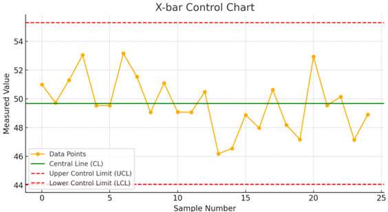
Components of a Control Chart
1. Data points: These are the symbols that represent the process data at different points in time. 2. Central Line (CL): The statistical measure of center of the dataset, the mean, which gives an idea of the location of the process. 3.
Upper Control Limit (UCL): A point is said to be out of control if it is above this limit. 4. Lower Control Limit (LCL): A point is said to be out of control if it is below this limit. 5.
Time Axis: This shows the different times at which the data was collected in sequence. 6. Control Limits Calculation: They are usually set at +/-3 standard deviations from the mean to include the natural variation.
Types of control charts
Variable control charts (For measurable data):
- X-bar and R Chart (Mean and Range)
- X-bar and S Chart (Mean and Standard Deviation)
- Individual and Moving Range (I-MR) Chart
Attribute control charts (For countable data):
- P Chart (Proportion of Defectives)
- NP Chart (Number of Defectives)
- C Chart (Number of Defects per Unit)
- U Chart (Defects per Unit with Varying Sample Sizes)
How control charts work
Control charts monitor the process continually and alert staff to conditions that are not typical of the process. They assist in the recognition of trends, shifts or patterns that are indicative of a point of change, be it a good one or a bad one. This approach is preventive in nature and is directed towards avoiding defects before they occur so that the process becomes stable and predictable.
How to construct a Control Chart
1. Select the process to monitor: Identify the characteristic to be monitored. 2. Collect data: Collect enough data to establish a baseline. 3.
Calculate statistical parameters: Find the mean, standard deviation and the control limits. 4. Plot the data: Present the values in a time series and draw the control limits. 5.
Analyze trends: Look for patterns, signals and variation that could indicate a change in the process. 6. Take corrective action: If needed, find the root cause and implement the solution.
How to interpret control charts
- Stable process: Data points remain within control limits without patterns or trends.
- Out-of-control process: Points outside control limits signal potential issues.
- Non-random patterns: Trends, cycles, or repeated patterns indicate an underlying cause that needs investigation.
- Sudden shifts: A drastic shift in the process mean suggests external influence or a fundamental change in the system.
Application of control charts
- Manufacturing Quality Control
- Healthcare
- Service Industry
- Supply Chain Management
Benefits of control charts
- Early detection of issues
- Improve process stability
- Enhances decision-making
- Reduces costs
- Supports continuous improvement
Disadvantages of control charts
- Initial setup complexity
- Misinterpretation risks
- Limited to historical data
- Not a standalone solution: Should be combined with other quality management tools for better results.
Conclusion
Control charts are a very useful tool in the control and improvement of process performance in most industries. They are very useful in monitoring the stability of the process, which is crucial in any organization desiring to achieve quality, reduce costs, and increase production efficiency. As there are some difficulties in the implementation and interpretation of the controls, the advantages clearly outweigh the disadvantages, and the charts are therefore a significant part of the quality management system based on data.